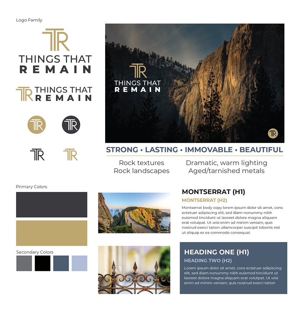
I worked with Things That Remain to develop their primary branding logo. We chose a letterform logo as their organization is commonly referred to as TTR. The logo creates a strong, balanced symbol and the stability of the icon helps communicate lasting nature of “things that remain.” I also helped define and create a visual style guide to be used on the website and publications going forward.